Where to Place Testimonials on Your SaaS Landing Page
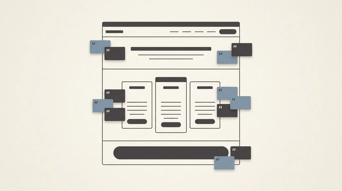
You have testimonials. Real ones, with names and faces, sitting in a document or scattered randomly down your homepage. And yet the needle on your signups barely moves. The problem usually is not the quality of your social proof. It is where it lives. A glowing quote buried below your fourth feature does nothing for the visitor who already bounced at the pricing table. Placement is what turns a nice quote into a conversion lever. This guide maps the five spots that matter most and, just as usefully, which doubt each one is there to kill. (If you do not have testimonials collected yet, start with How to Ask SaaS Customers for Testimonials Politely and come back here.)
Why placement matters more than the testimonial itself
A visitor moves through your page in a sequence of small decisions, and at each step a different question surfaces. “Is this real?” comes first. “Is it worth the money?” comes at pricing. “Should I act now?” comes at the button. A testimonial only converts when it shows up exactly as the matching doubt forms. Scattering quotes evenly across the page treats every section as equal, but they are not. Stop decorating the page with praise and start placing each quote where a specific decision happens.
Above the fold: the trust signal before the ask
The top of your page makes a promise. A first-time visitor has no reason to believe it yet, so the objection here is simply “is this legit?” One short, credible line near the hero answers that before you ask for anything. Keep it tight: a single sentence, a real name, a role or company, ideally a photo or logo. This is the above-the-fold versus wall-of-love tradeoff in action. The wall comes later; up top you want one sharp proof point, not a gallery. If you can mark this quote up so a star rating can appear in search results, do it, since review schema markup for star ratings makes the proof work before the click even happens.
Beside your pricing: answering “is it worth it?”
Pricing is where the most motivated visitors get cold feet. They want the product; they are just not sure it justifies the cost. A testimonial placed right next to your plans answers that head-on, and the best one here speaks to value or outcome rather than general happiness. A quote that mentions time saved, a result reached, or “cheaper than the thing it replaced” reframes the price as a trade the reader is glad to make. Social proof near the pricing section is one of the highest-leverage spots on the page precisely because it meets hesitation at its sharpest point.
Next to every CTA: removing last-second hesitation
Every call to action is a small moment of commitment, and commitment invites second-guessing. A brief proof point beside the button gives the visitor one last reason to click instead of “I will think about it.” This works for your secondary CTAs too, not just the hero button. Match the quote to the action: near a “start free trial” button, a line about how easy it was to get started reassures the reader that clicking will not cost them an afternoon. Near a “book a demo” button, a quote about responsive support or smooth onboarding lowers the perceived risk of talking to a human.
Inline with features and the wall of love: where each one belongs
Inline testimonials and a dedicated wall serve different jobs, so do not confuse them. A quote placed next to a specific feature proves that one capability actually delivers. If you claim your reporting saves hours, put the customer who said exactly that right beside it. The wall of love, on the other hand, is about volume and breadth: a grid of many voices that signals “lots of people like you trust this.” Use the wall as a deeper section for visitors who are already interested and want to confirm the pattern. One feeds belief in a claim; the other feeds belief in the crowd.
Match each testimonial to the objection it answers
The thread running through all five spots is the same: a testimonial is an answer, so place it next to the question. Make a quick list of the doubts a visitor has at each stage (is it real, does it work, is it worth it, should I commit) and assign your strongest quote to each one. Most makers have plenty of testimonials and simply put them in the wrong places.
The harder part is keeping that system fresh. Quotes go stale, customers churn, and a wall last updated a year ago quietly erodes trust instead of building it. This is where XLens Review earns its place: it lets you collect authentic reviews from your customers and publish them on your own site, so the proof in each of these five spots stays current and keeps doing its job long after you set it up. Place your testimonials with intent, keep them honest and recent, and let them answer the doubt at the exact moment it appears.